Switch
Rebranding, nur einfach.
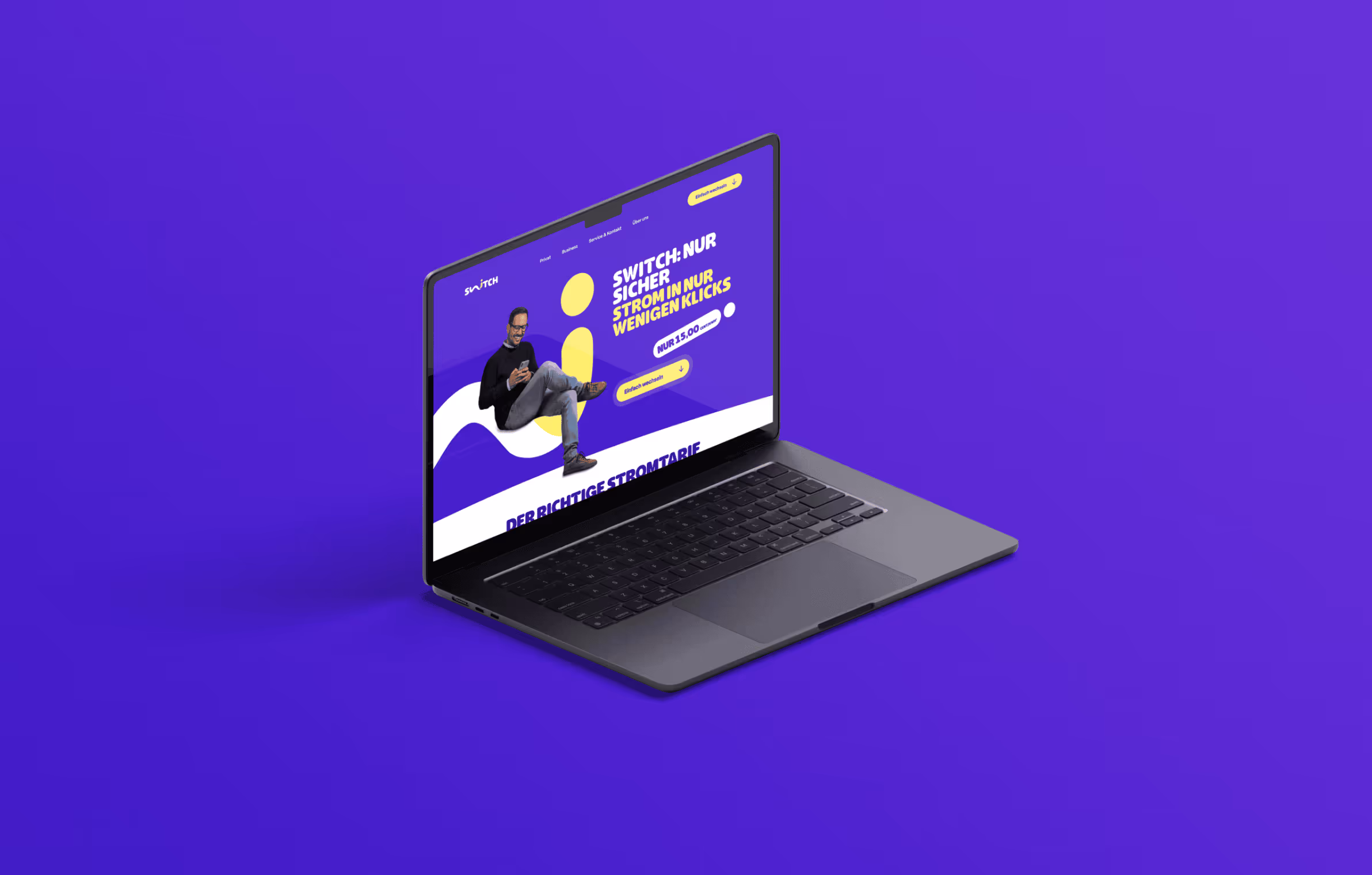
The electricity provider Switch focuses on low-cost and simple electricity tariffs. They were looking for a campaign with a modern look that gets to the heart of the message.
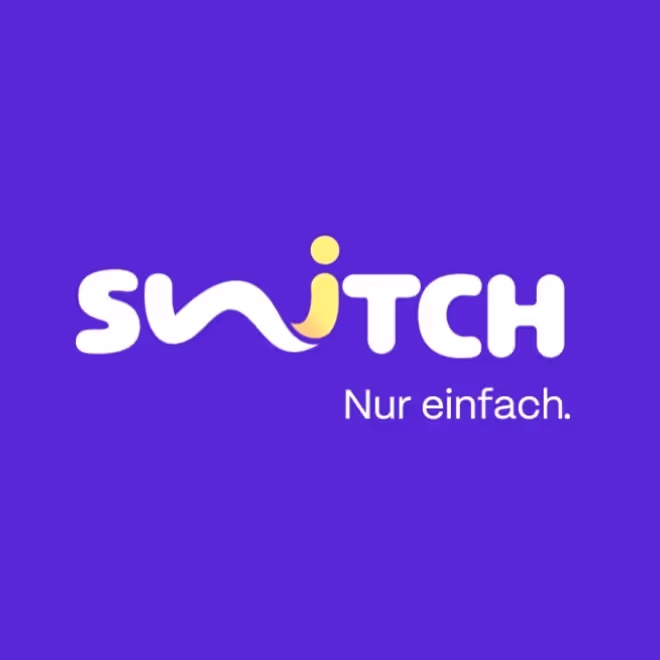
A new claim “Nur simpel.”, a new website, a new look and a matching campaign:
Everything from a single source and in a single style.


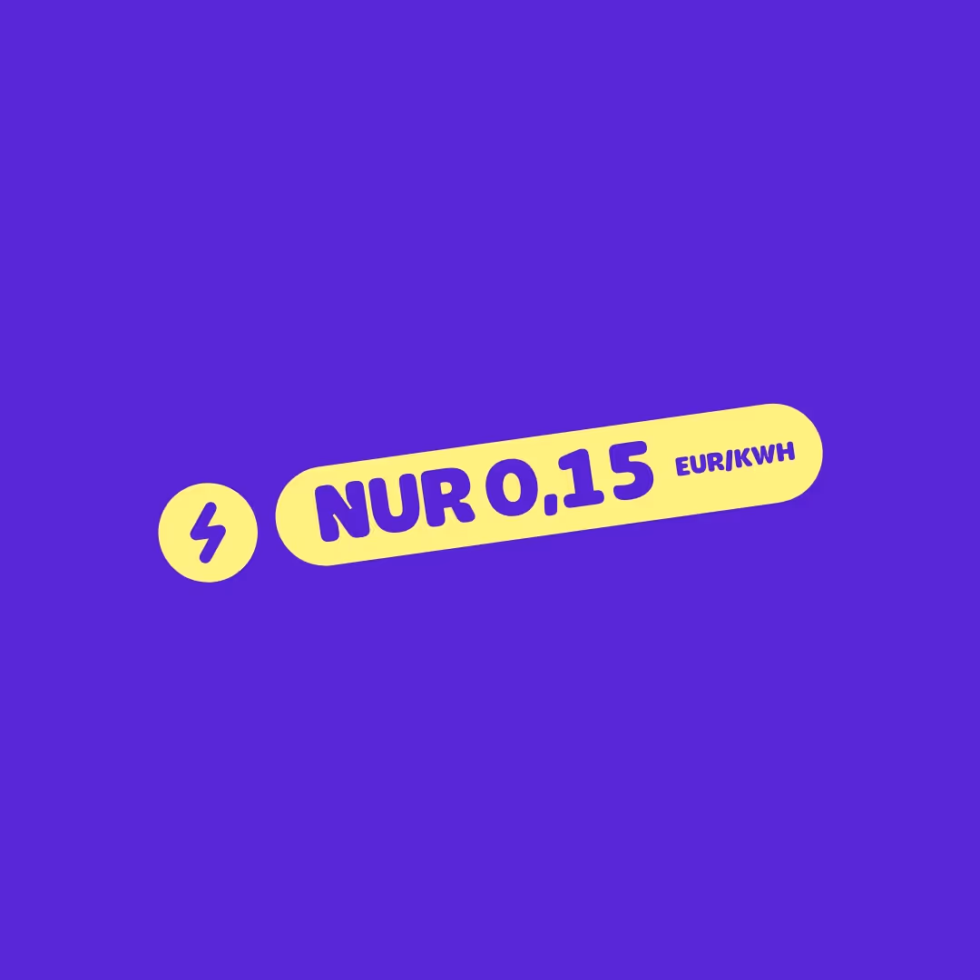
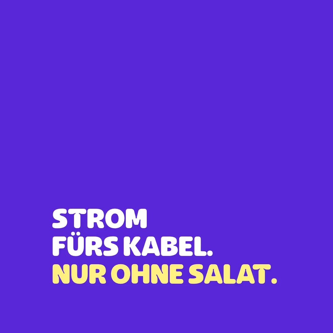
Eye-catching colors, modern typography and clear language: the look and tonality clearly set it apart from the competition and make it stand out. A contemporary image style and pictograms that score points with creative animations round off the package. All in all, an advertising presence that is new and fresh.